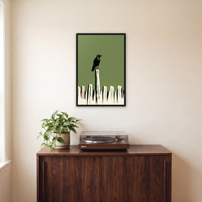
How to choose a frame color
Black, white, oak or walnut. The frame is the last decision and often the hardest, but it follows a few simple rules. Here they are, with a table for when you just want an answer.

The frame is the last decision and often the hardest. The art is chosen, the size is right, and then there are three or four swatches that all look plausible. The good news is that frame color follows a few simple rules, and once you know them the choice usually makes itself. This guide covers the four finishes that matter most, black, white, natural oak and walnut, when each one works, and how to keep a room consistent once you have more than one piece on the walls.
Start with what the frame is for
A frame has two jobs. It protects the piece, and it draws a line between the art and the wall. Every color decision is really about that line: how strong it should be, and whether it should belong to the art or to the room.
- A strong line (usually black) separates the art from the wall and makes it read as a graphic object. It suits bold work and busy walls.
- A soft line (white, or a frame close to the wall color) lets the art float and keeps the wall calm. It suits light, airy work and pale rooms.
- A warm line (wood) connects the art to the furniture and floors. It suits rooms with a lot of wood already in them.
Decide which of those you want before you look at swatches, and half the options fall away.
Black frames
Black is the safest frame color and the one most people end up with. It works with almost any art and any wall, because it reads as an outline rather than a color.
Choose black when:
- The art is graphic, high contrast or has black in it: typography, posters, line work, night scenes, black and white photographic pieces.
- The wall is white or very light and you want the piece to stand out.
- The room has black hardware, metal lamps, black window frames or dark furniture.
- You are building a gallery wall from very different pieces. Matching black frames are the quickest way to make a mixed group look intentional.
Be careful with black when the art is very soft and pale, like a misty landscape or a pastel botanical. A heavy black outline can overpower it. On a dark wall, black frames also tend to disappear, which can be the point, but usually is not.
White frames
White frames are the quiet option. On a white wall they almost vanish, so the art seems to sit straight on the plaster; on a colored wall they act like a thin border of light.
Choose white when:
- The art is light, airy or full of white space: coastal scenes, skies, minimal compositions, soft florals.
- The room is bright and pale: white walls, linen, light woods, a beach-house or Scandinavian feel.
- The wall is a saturated color, like sage, navy or terracotta, and you want a crisp edge that does not compete.
Be careful with white when the art itself is very white at the edges. The frame and the image can blur together. A dark or wood frame gives the picture a clearer boundary.
Natural oak frames
A natural oak frame is pale, warm wood with visible grain. It sits between black and white: softer than black, warmer than white. It is the frame color that suits the most rooms people are decorating right now, because so many of those rooms already have light wood in them.
Choose natural oak when:
- The room has light wood floors, oak furniture, rattan, cane or linen. Scandinavian, Japandi and modern farmhouse rooms all fit here.
- The art has warm tones: earth colors, sunlit landscapes, terracotta, gold, cream.
- You want the art to feel like part of the room rather than an object hung on it.
Be careful with oak when the room's wood is a very different tone. Oak next to cherry or orange-toned pine can look accidental. If you cannot match the wood, contrast it on purpose with black or white instead.
Walnut frames
Walnut is dark, rich brown wood. On our pieces it is a canvas option, used for the floating frame. It is a more traditional, more furnished look than oak, and it gives a piece weight.
Choose walnut when:
- The room has mid-century furniture, dark wood, leather or a record console.
- The walls are warm: cream, tan, olive, deep green or rust.
- The art has deep, saturated colors that can hold their own next to a dark frame.
Be careful with walnut when the room is very pale and cool. A single walnut frame in an all-white room can look like it came from somewhere else.
Reading the art itself
When the room gives no clear answer, look at the edges of the picture rather than the middle. The frame sits next to the outer inch of the image, so that is the part it has to work with.
- Dark edges, like a night sky or a deep shadow, look best with a frame that contrasts: white or natural oak. A black frame merges into them and makes the piece look smaller.
- Pale edges, like a bright sky or open paper, want a defined frame: black or wood. A white frame blurs into them.
- Warm color running to the edge, like sand, terracotta or gold light, pairs naturally with oak or walnut, which carry the same warmth.
A quick way to decide
| If the room is… | And the art is… | Try |
|---|---|---|
| White walls, little wood | Bold, graphic, high contrast | Black |
| White walls, little wood | Soft, pale, airy | White or natural oak |
| Light wood floors and furniture | Warm or earthy | Natural oak |
| Light wood floors and furniture | Cool or graphic | Black |
| Dark wood, leather, mid-century | Deep, saturated color | Walnut or black |
| Colored wall (sage, navy, rust) | Anything | White for a crisp edge, oak for a warm one |
| Dark wall (charcoal, ink, forest) | Anything | Natural oak or white; black disappears |
Match the room, not the art. When two options both look right with the picture, pick the one that matches something else in the room: the floor, a table, the lamp base, the window frames. A frame that repeats a material already in the room always looks chosen.
Keeping a room consistent
Once there is more than one piece in a room, the frames start talking to each other. A few habits keep that conversation tidy:
- One finish per wall. A gallery wall in a single frame color reads as one composition. Mixed frames can work, but they take more planning, and the result is easier to get wrong.
- Two finishes per room at most. For example, black above the sofa and oak in the reading corner. More than two starts to look like a collection of things bought at different times.
- Match frame width too. Frames of the same color but very different widths look mismatched. Ours are all .875" wide, so they sit together on one wall without thinking about it.
- Repeat across rooms you can see at once. If you can see the hallway from the living room, using the same finish in both makes the home feel considered.
Frame color and canvas
Canvas can go without a frame entirely. A gallery-wrapped canvas has finished sides, so the edge of the picture is the edge of the piece. If you want a frame, a floating frame holds the canvas from behind with a small shadow gap, so it adds a line around the work without covering any of it. The same color rules apply, with one difference: because a floating frame is set back and thin from the front, it reads as a quieter line than a paper print's frame, so walnut and black feel less heavy on canvas than you might expect.
What we offer
Our framed prints come in natural oak, white or black: a solid wood frame, .875" wide, mitered at the corners, with a clear acrylic front and the hanger fitted. Our canvas prints come unframed or in a slim floating frame in walnut, natural oak or black, with a .25" shadow gap. Every product page shows the piece in each frame and in real rooms, so you can compare them before you choose. If you are still deciding on size, start with the poster sizes guide; the frame is easier to pick once the size is settled.
Shop the guide
The collections this guide points to.